Surprise Me! (TED App)
Challenge
Users have trouble discovering interesting content in the TED app and even superfans aren’t aware of the breadth of TED’s content offerings.
Objective
Build a new app feature that exposes users to a breadth of content they'd enjoy but not normally seek out.
My Role
UX Lead
Timeline
7 weeks
OPPORTUNITY
——
——
Users have trouble discovering content in the app and aren’t interested in recommendations from a new personalization engine. Prior research found content discovery is primarily impeded by a lack of category and thematic browsing.
While the team works on long-term solutions⏤overhauling category taxonomies, implementing category landing pages and retooling the personalization engine⏤we needed an interim solution.
DISCOVERY RESEARCH
——
——
To learn why recommendations don’t resonate with users and uncover quick-win ideas to boost content discovery, I led a round of discovery user research.
Parsed app analytics so usage trends could emerge.
Analyzed mobile engagement trends of 25M+ TED followers across LinkedIn, YouTube, Facebook and Instagram.
Led 5 moderated tests of live app to explore the ‘why’ behind known usage patterns and uncover blindspots.
Polled 1,500+ app users and social media followers via 2 concept-testing surveys.

Research Findings
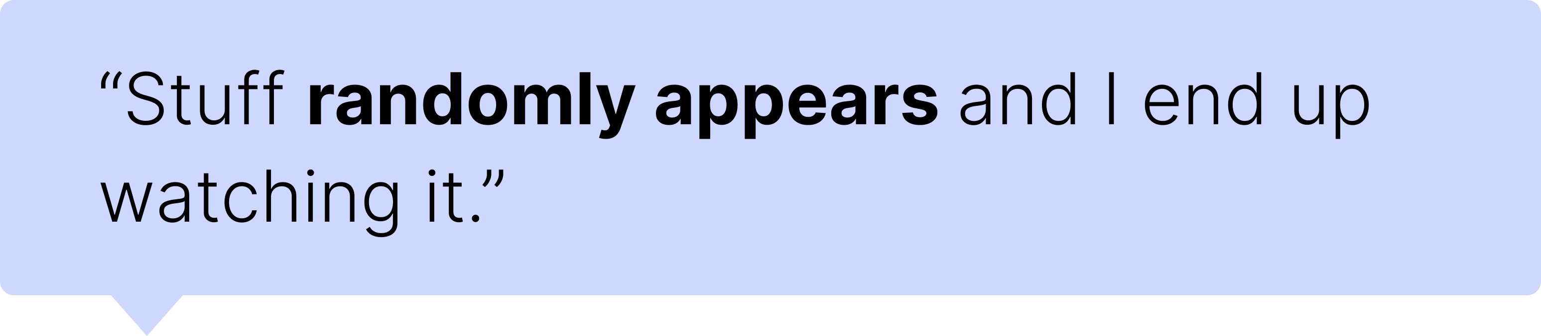
Users don’t look for content. They stumble upon it.
Since social platforms are users’ go-to source for content, the bar is high for how publishers package and deliver media. Most content consumed is happened-upon, not sought-out.
——
Since social platforms are users’ go-to source for content, the bar is high for how publishers package and deliver media. Most content consumed is happened-upon, not sought-out.
Over-personalization backfired.
——
Tailoring content to user interests limits the joy of finding something interesting you previously thought was boring. This ability to offer a new way of thinking makes TED different—we expose users to topics they wouldn’t normally seek out.

CONCEPT
——
——
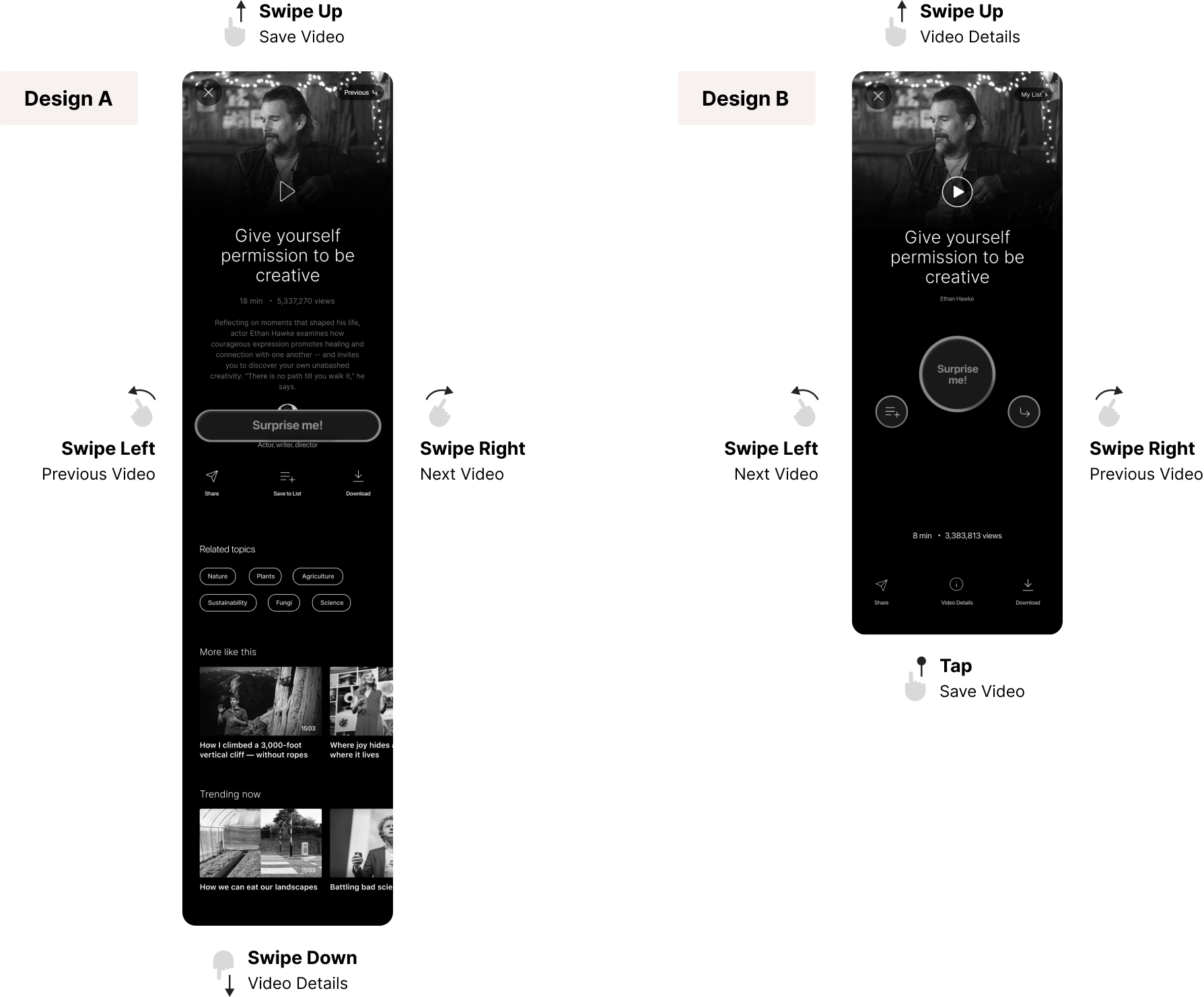
After affinity mapping research findings, we opted to create video-randomizer feature users swipe through like a dating app or deck of cards. To counteract the personalization issue, we leaned into randomness and switched the burden of discovery so the platform does the heavy lifting, not the user.
DESIGN KPIs
——
——
Boost Discovery
Expose users to a breadth of content they'd enjoy but not normally seek out.
Increase # videos users see (not watch) in a session
Increase # of video plays per user/session
Increase # of shares per user/session
Boost Retention
Encourage users to save as they swipe, to sustain browsing while curating content for future consumption.
Increase # of sessions per user/month
Increase # of saves per user/session
Increase % of signed-in users
PLANNING
——
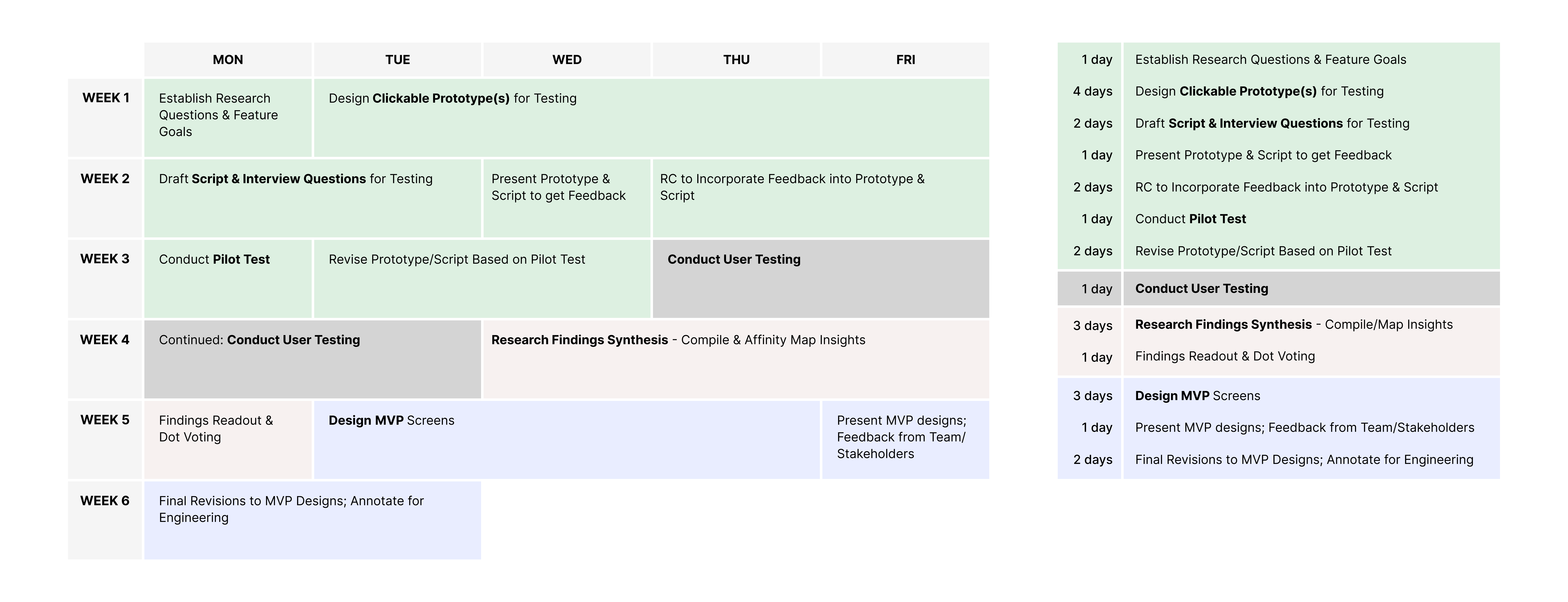
Design & Testing Timeline
——
Since there was no time allocated for user testing, I created a timeline to show stakeholders how it could easily be baked into the design process.
The timeline covers all facets of design⏤from paper prototyping to recruiting usability testers to hi-fi designs.
DESIGN
——
Play & ExperimentationI kicked off the design process by creating a sandbox file to explore what I wanted (and didn’t want) the experience to feel like.
- What actions will be most common?
- Upon finding an interesting video, what will users do next?
- What gestures feel most natural?
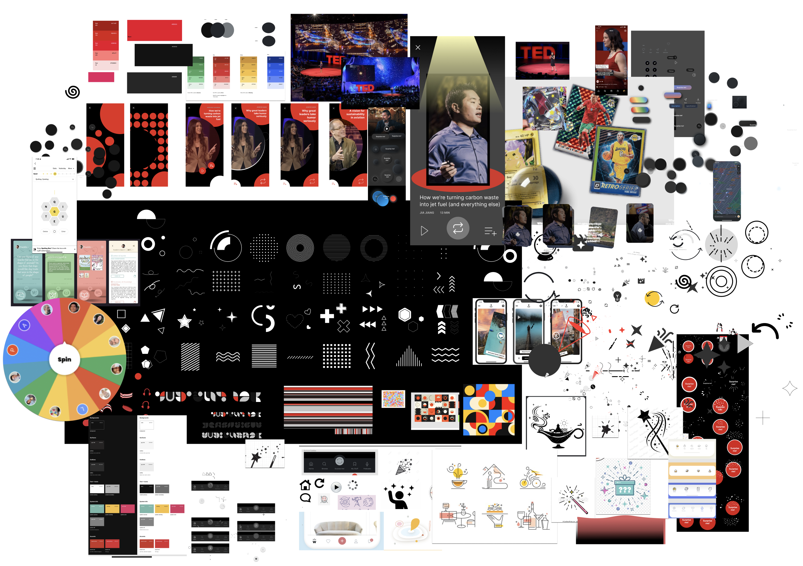
Content Scaffolding & Hierarchy
What info do users need to quickly decide if a video is of interest?
What info do users need to quickly decide if a video is of interest?
Choosing a video is hard because imagery of speaker contributes very little. And, unlike an article, you can’t scan text and subheads to see the content is worth your time.
USABILITY TESTING
——
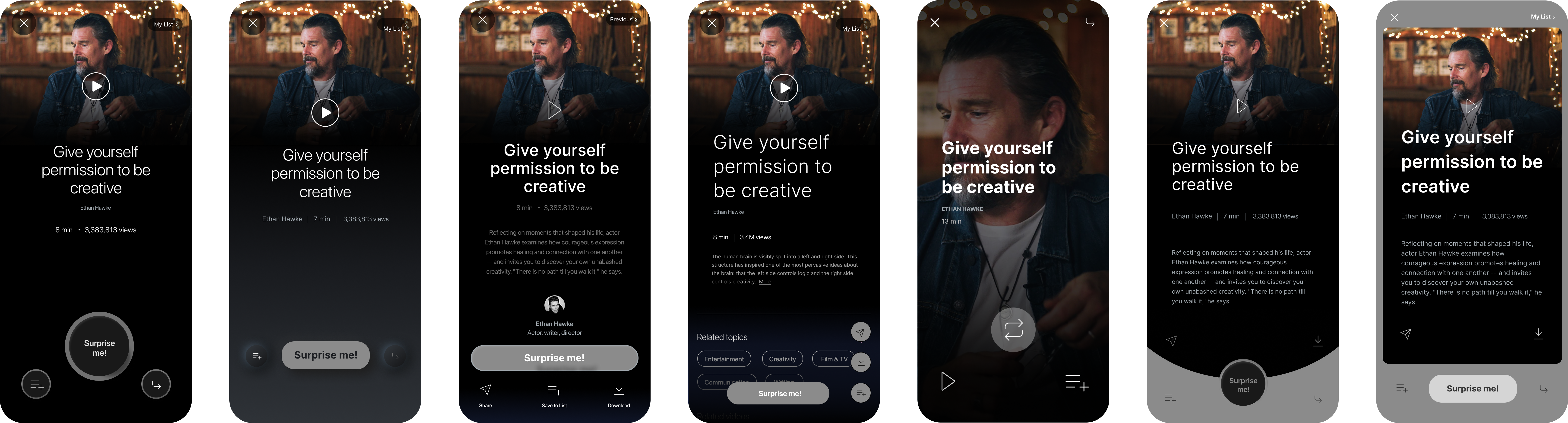
Which design performs better?I led 8 sessions testing 2 different prototype designs.
Key Questions: - How well do users understand what system does and how to operate?
- How easily are gesture operations discovered?
- Which version sustains attention longer?
- How well do users understand what system does and how to operate?
- How easily are gesture operations discovered?
- Which version sustains attention longer?
Design with lightest cognitive load kept users engaged longer, as browsing paths disrupted flow and discouraged engagement.
The most important design element proved to be having an information-bearing title with nothing below the fold.
MVP DESIGN
——
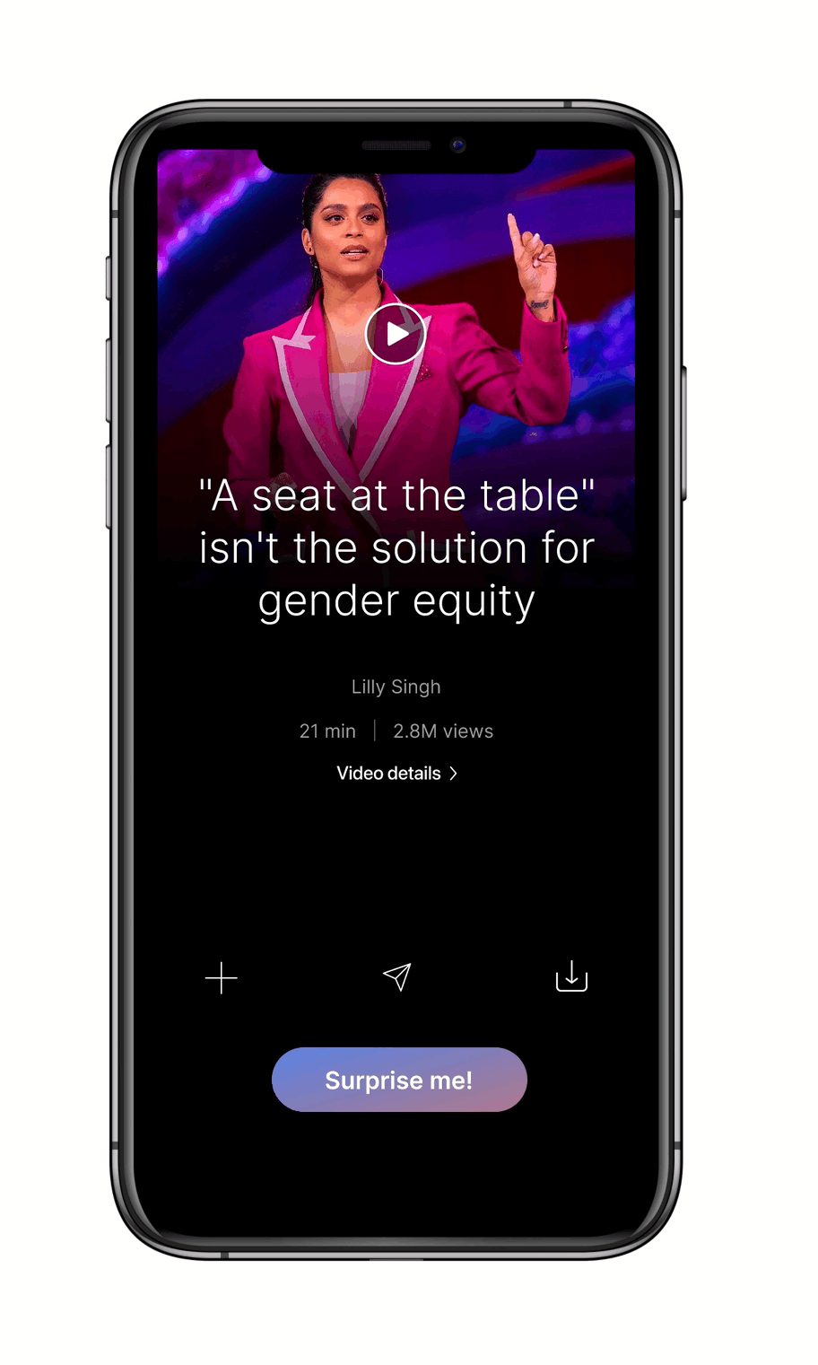
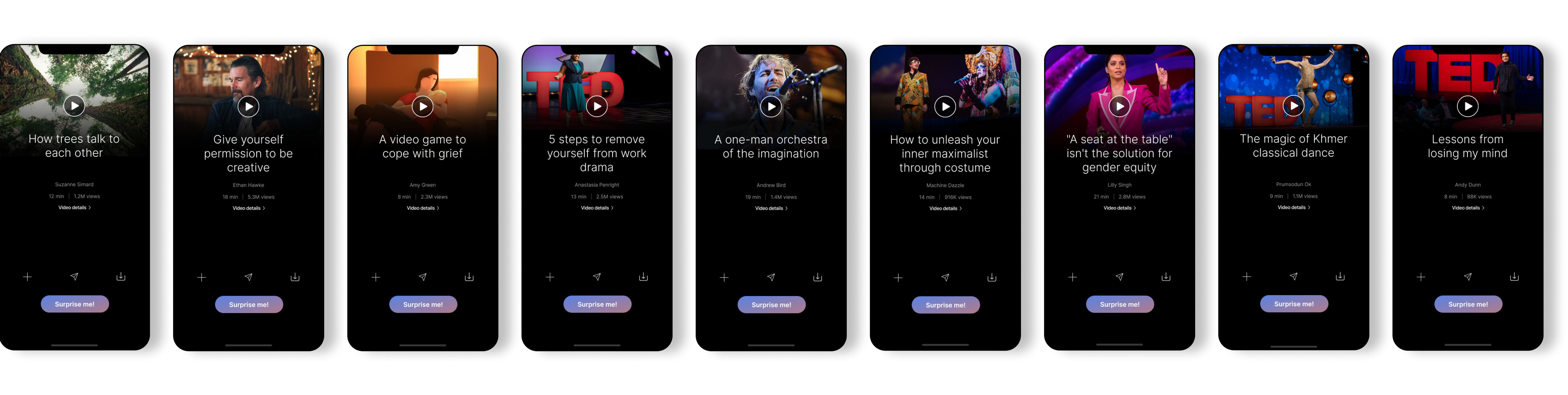
An immersive experience focused on spontaneity and simplicity.Gives users feeling of control and choice while exploring a vast amount of content.
Prepping designs for handoff
I captured and annotated all potential use cases to:
- Communicate path logic to engineering teams
-
Ensure all states and use cases were accounted for
- Ensure accurate translation and implementation of new pages and components
- Communicate path logic to engineering teams
-
Ensure all states and use cases were accounted for
- Ensure accurate translation and implementation of new pages and components


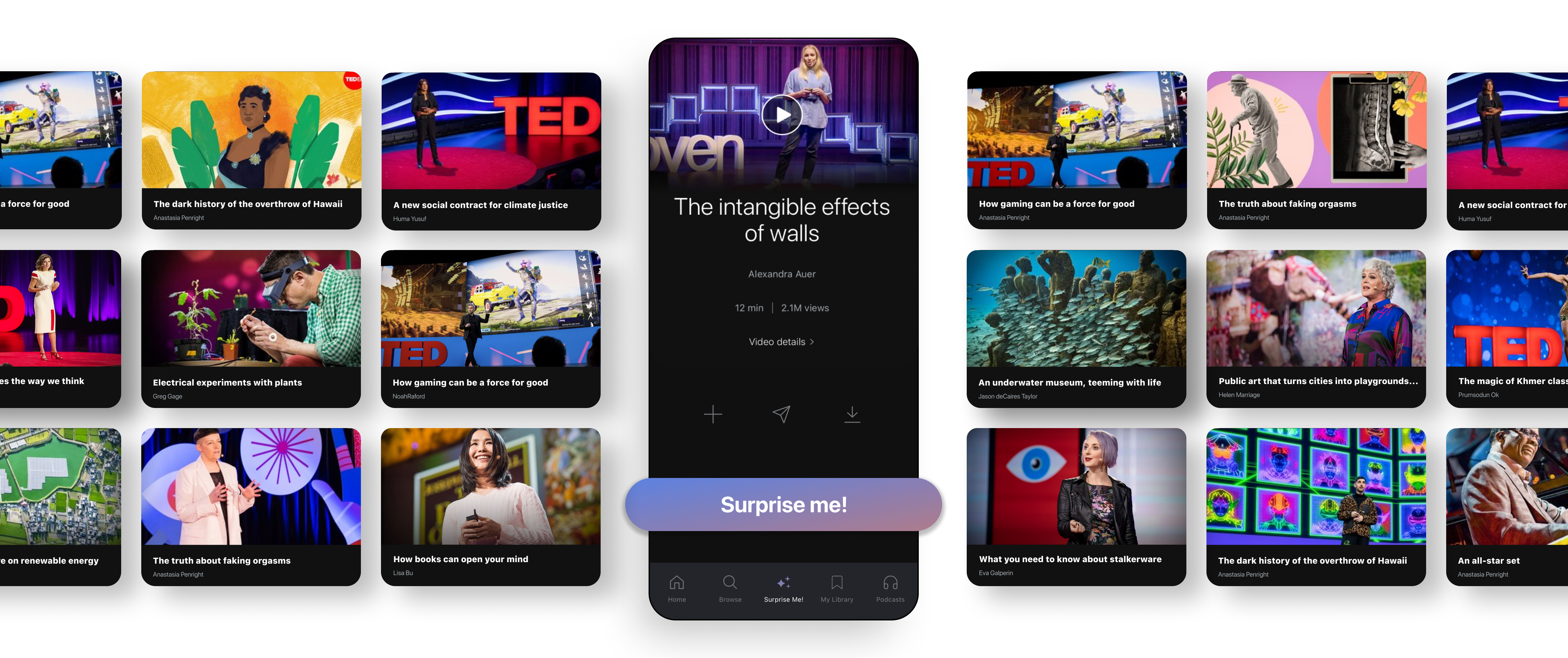
RESULTS
——
1-month post launch ——