Tags:
My head hurts
I've been disappointed by the New York Times' presidential election and COVID-19 infographics (especially on mobile).
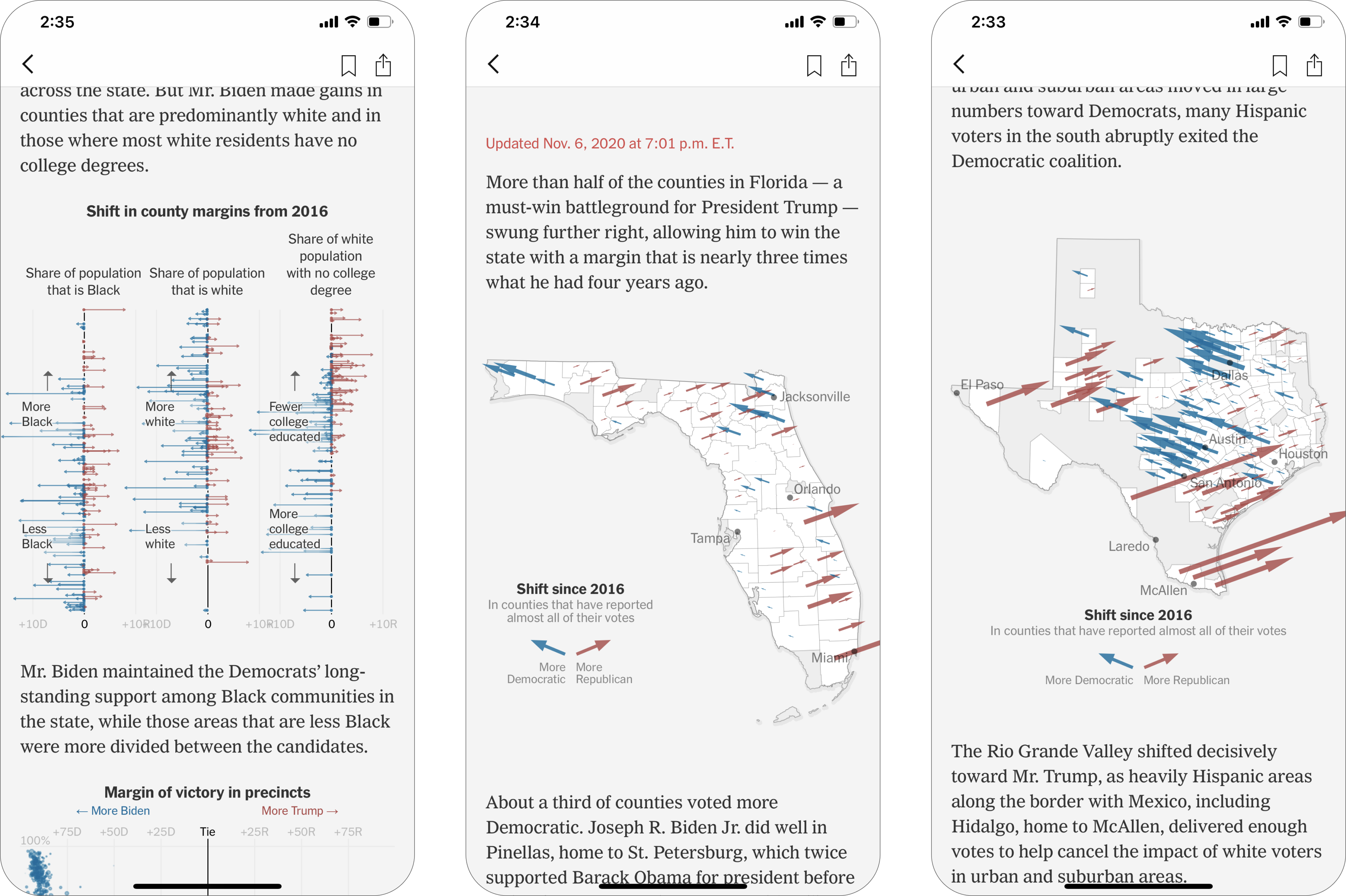
Based on the outcome of the 2020 presidential election, the charts below are supposed to show how much more red (Republican) or blue (Democratic) counties have become since the 2016 election.
The only information I can derive from these is that blue counties got blue-er and red counties got red-er (not shocking). This is somehow hard to derive from these charts but also exremely obvious/duh information.
![]()
Based on the outcome of the 2020 presidential election, the charts below are supposed to show how much more red (Republican) or blue (Democratic) counties have become since the 2016 election.
The only information I can derive from these is that blue counties got blue-er and red counties got red-er (not shocking). This is somehow hard to derive from these charts but also exremely obvious/duh information.