My Library (TED App)
Context
First major redesign of TED’s mobile app in 4 years
Objective
Create a hub in the TED app where users can easily access their saved, downloaded and recently viewed videos and podcasts.
My Role
UX Lead
Timeline
8 weeks
Results
Check it out on the app store →
- +275% video starts
- +150% video completes
- +6% app sentiment score
PROBLEM
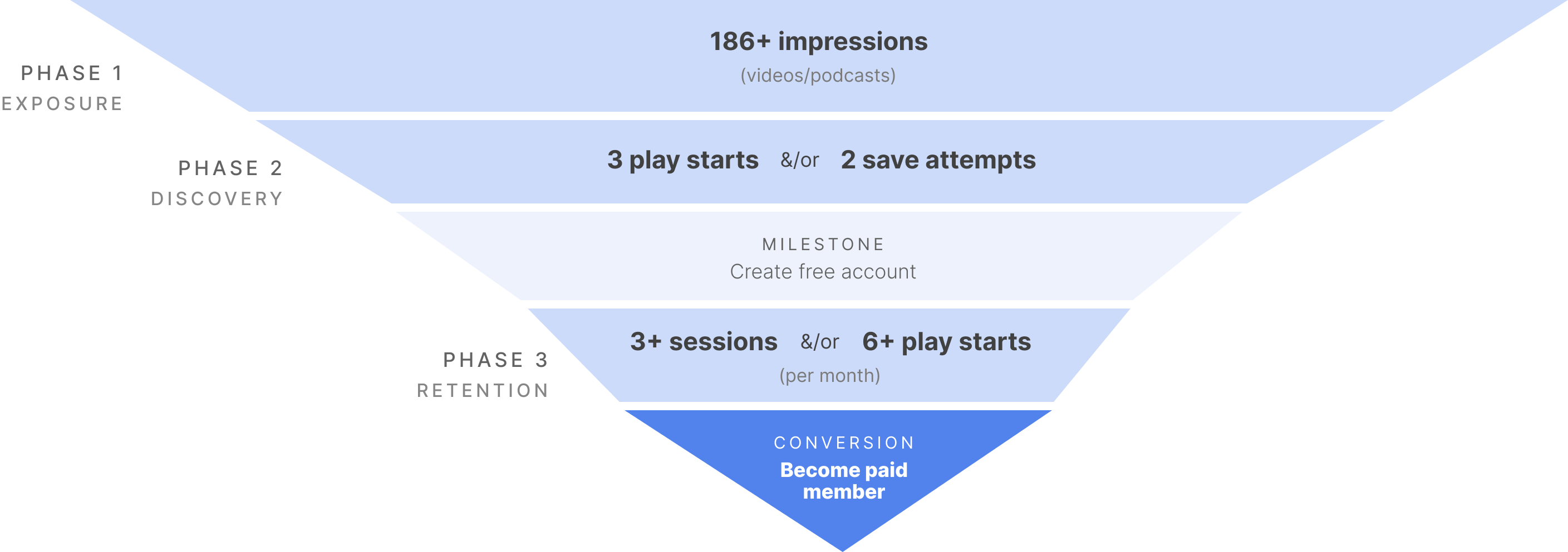
Users rarely return to the app after setting up their account
Thus, account holders rarely make it to the final stage of the monetization funnel and retention rates lag behind industry averages.
OPPORTUNITY
Super users generate 2x more ad revenue than casual users.
Account holders who use the app regularly are also 2x more likely to start a video and 6x more likely to return.
Features popular with super users are ignored by newcomers.
Superfans are avid users of their Saved, Downloads and Watch-History lists⏤features ignored by new account holders.
SOLUTION
Create a hub where users can easily access their saved, downloaded and recently viewed content.
Boost discoverability of features beloved by super users to keep new account holders in the funnel.
DESIGN GOALS & KPIs
Decrease time (seconds) from launch to play start (from My Library)
Increase # (from My Library)
Increase # of sessions per user/month
Increase # per user/session
DETERMINING MVP
Current-state analytics guided MVP functionality, by providing insight into actual usage, at scale.
To determine MVP and realistically quantify the risk of deprecating existing features, I leveraged sequential clickstream data to see how people were currently using the app. I made a running list of research questions and matched each to an analytics query that could help answer. I also cross-checked each question against comparative apps to understand popular mental models for usage.
To determine MVP and realistically quantify the risk of deprecating existing features, I leveraged sequential clickstream data to see how people were currently using the app. I made a running list of research questions and matched each to an analytics query that could help answer. I also cross-checked each question against comparative apps to understand popular mental models for usage.
To determine MVP and realistically quantify the risk of deprecating existing features, I leveraged sequential clickstream data to see how people were currently using the app. I made a running list of research questions and matched each to an analytics query that could help answer. I also cross-checked each question against comparative apps to understand popular mental models for usage.
To determine MVP and realistically quantify the risk of deprecating existing features, I leveraged sequential clickstream data to see how people were currently using the app. I made a running list of research questions and matched each to an analytics query that could help answer. I also cross-checked each question against comparative apps to understand popular mental models for usage.
MVP DESIGN
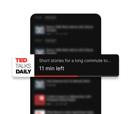
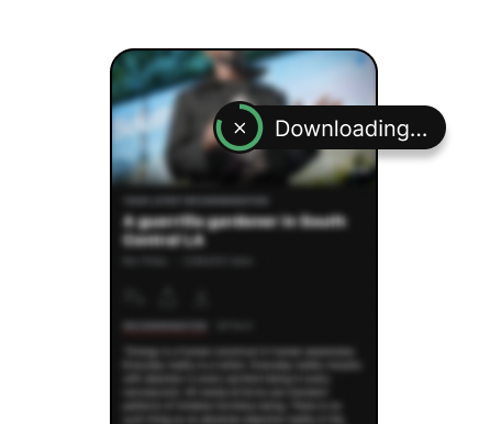
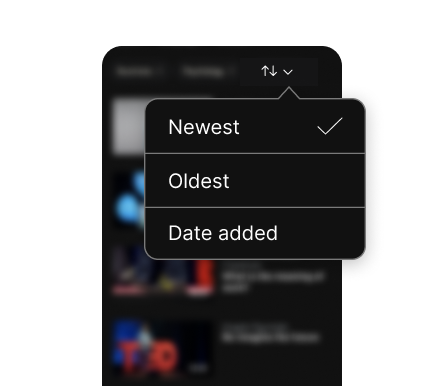
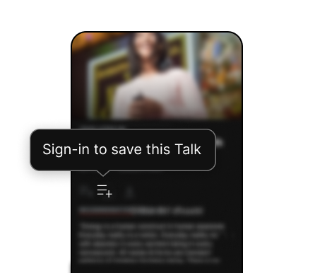
Unified the navigation experience⏤tying Saved, Downloads and Watch-History together for the first time
I made it easier to access these lists by moving them out of user’s profile into their own hub on the universal nav bar.
These changes marked the app’s first major redesign in 4+ years.
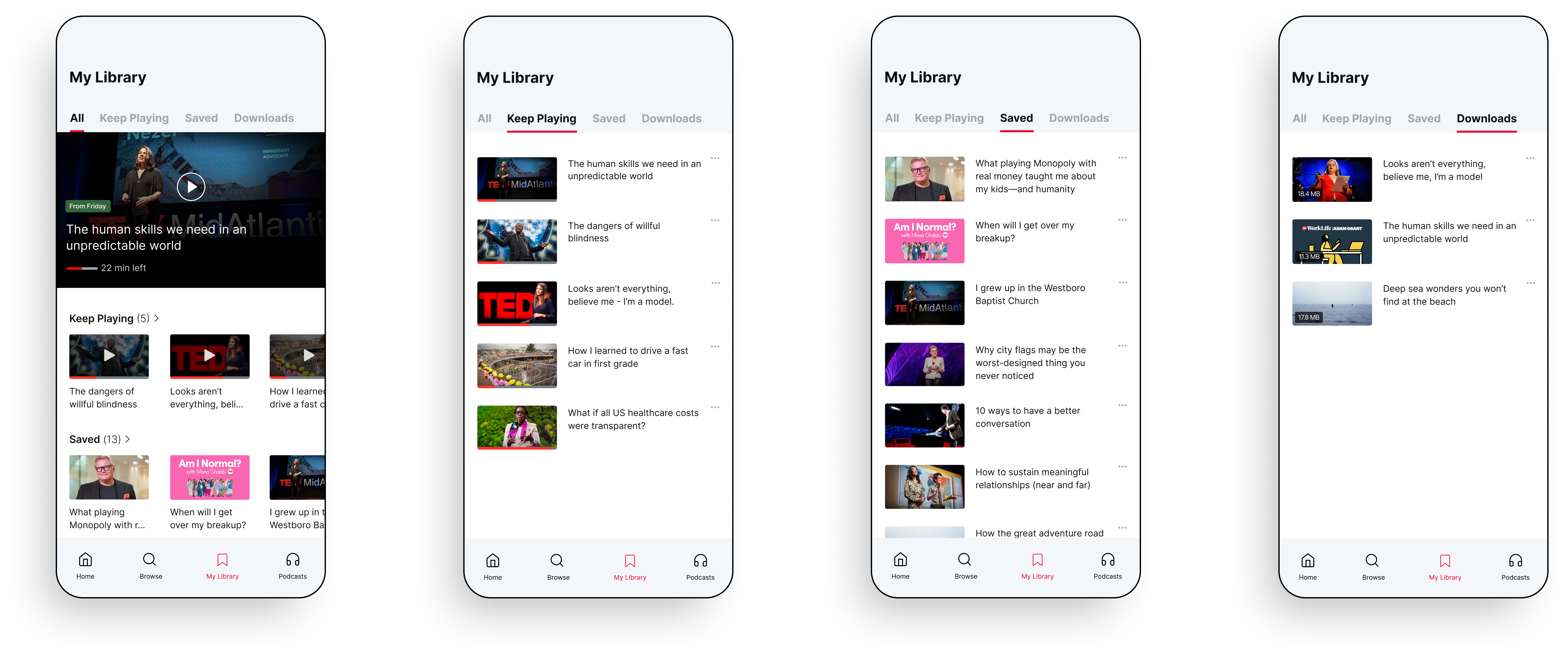

Fuss-free routing pages designed for quick glances
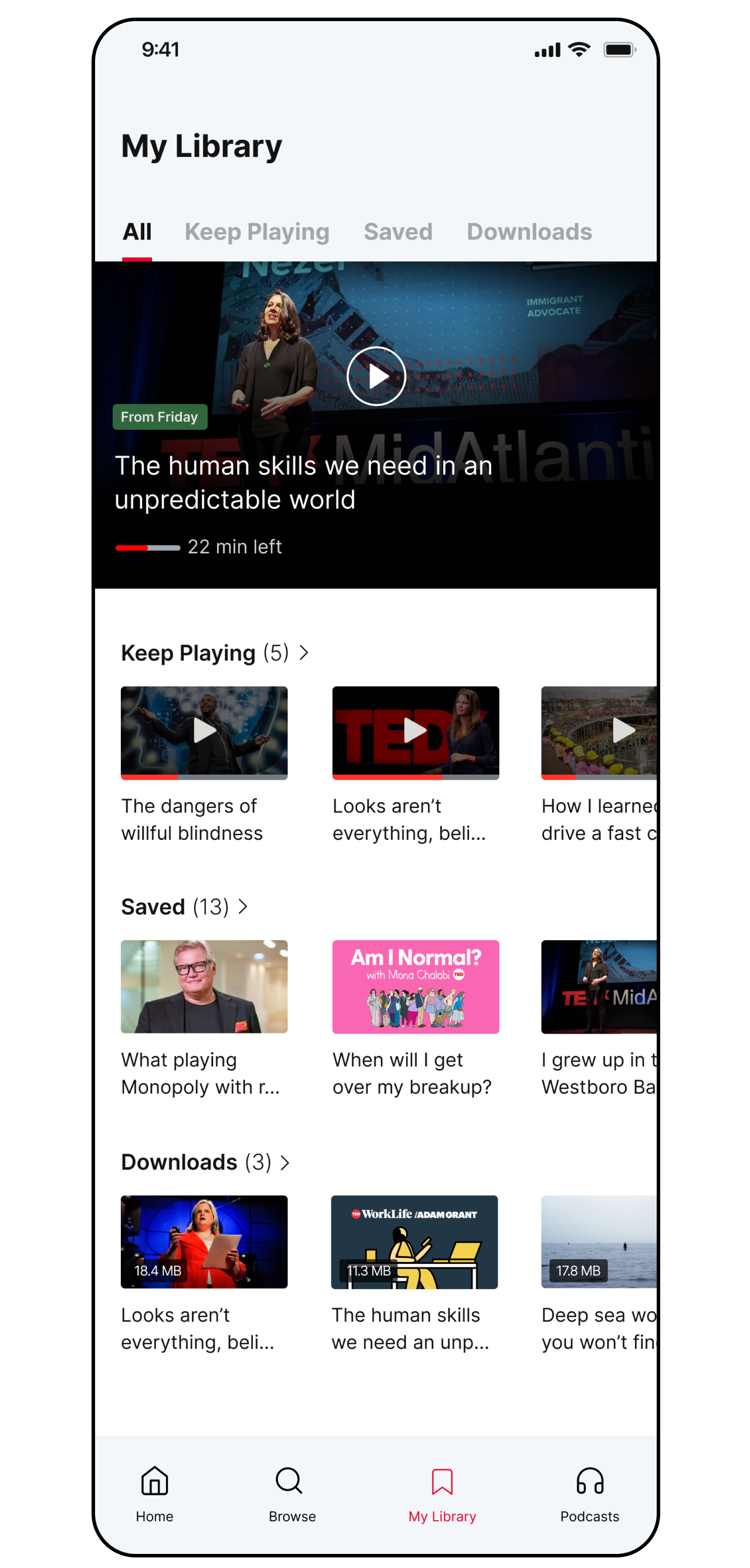
Rather than optimizing for browsing and exploration, I designed My Library like a table of contents, allowing users to easily pick up where they left off.
I wanted to display as much as possible above the fold, instead of giving more context about videos/podcasts the user is already familiar with.
For example, I used smaller thumbnails, truncated titles and omitted speaker names.
I wanted to display as much as possible above the fold, instead of giving more context about videos/podcasts the user is already familiar with.
For example, I used smaller thumbnails, truncated titles and omitted speaker names.

Prepping for handoff
To communicate path logic to engineers in a self-explanatory way, ensuring accurate translation and implementation of new components across color modes and devices.

RESULTS
1-month post launch
(310k feature adopters)