Concept Testing (TED App)
Objective
Conceive of a new app feature that boosts retention and promotes sharing, to capitalize on TED’s massive social-media following.
My Role
Develop and execute a plan for concept testing of potential features to gauge desirability with users. Then, collaborate with product team and stakeholders to determine most viable concept.
Output
Project will result in a go-foward feature idea, manifested as proof-of-concept wireframes constituting an authentic experience to test with users (to determine MVP feature set).
Project will result in a go-foward feature idea, manifested as proof-of-concept wireframes constituting an authentic experience to test with users (to determine MVP feature set).
Timeline
5 weeks (2022)
Problems & opportunities
TED’s social following doesn’t translate into app users
Feature should promote social sharing to capitalize on and activate this fanbase.

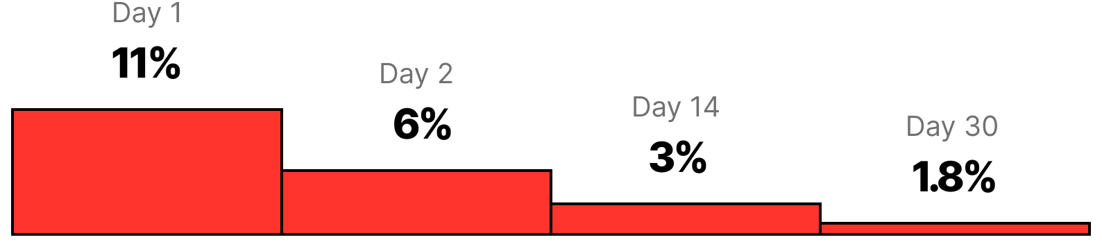
Only 2.8% of new users return after 30 days
Feature should incentivize repeat visits and differentiate from YouTube, where majority of TED Talks are watched.
Preliminary research
I also compiled app store reviews and previous research reports to help fuel ideas for an initial team brainstorm of feature ideas.
I began by teaming up with TED’s social team to learn everything I could about our followers.
I also compiled app store reviews and previous research reports to help fuel ideas for an initial team brainstorm of feature ideas.

Initial feature brainstorm
Guided by insights compiled thus far, the team convened for an initial brainstorm of feature ideas, extracting the key benefit of each.
To narrow down ideas and/or uncover ideas we haven’t thought of, we needed to conduct concept testing.

Concept testing
Key Research Questions
- What’s demand/appetite for each idea?
- What ideas haven’t we thought of?
- How does our audience use TED to learn?
- What apps do they loving using regularly?
- What are their expectations re: sharing?
Recruitment
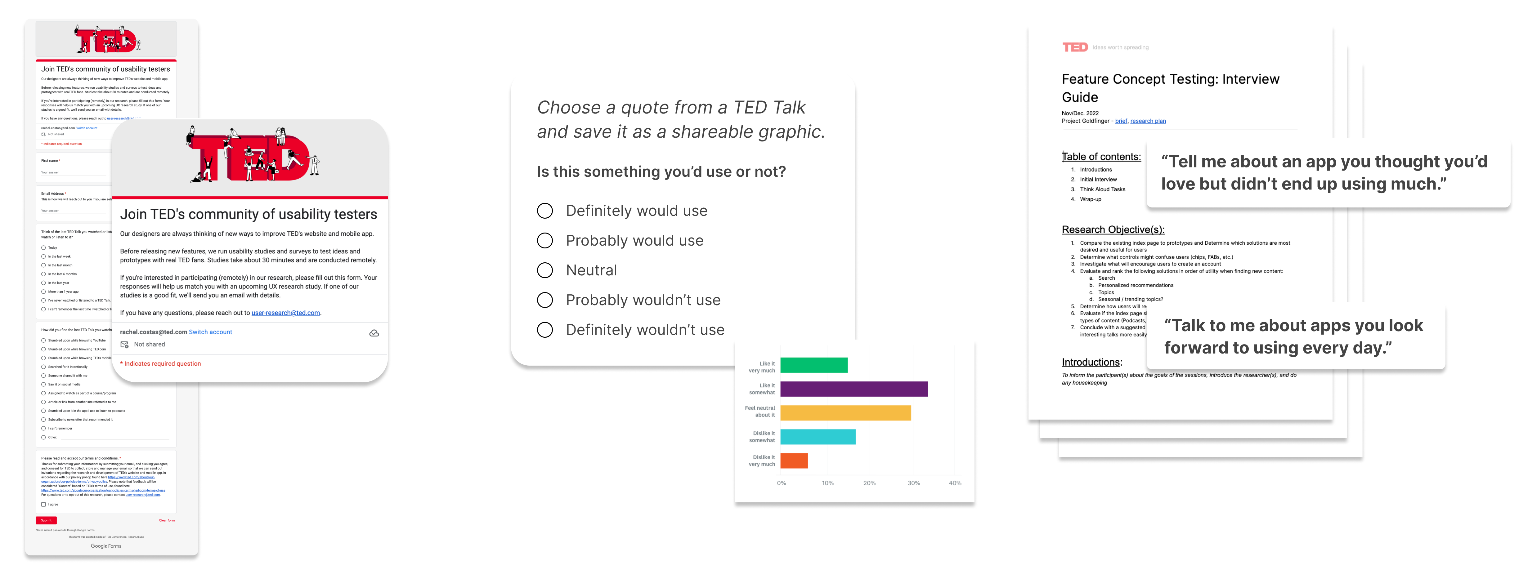
Since I primarily wanted to hear from TED’s casual social followers, I asked the marketing team to post a call for participants across our social channels (38M+ followers). I seized this opportunity to create the TED Community Research Panel. Rather than recruiting volunteers for this particular study, I asked followers join a database of UX research participants we will reach out to on an ongoing basis. The social post was a success, as we recruited 900+ volunteers.
Since I primarily wanted to hear from TED’s casual social followers, I asked the marketing team to post a call for participants across our social channels (38M+ followers). I seized this opportunity to create the TED Community Research Panel. Rather than recruiting volunteers for this particular study, I asked followers join a database of UX research participants we will reach out to on an ongoing basis. The social post was a success, as we recruited 900+ volunteers.
Survey & Interviews (Concept “Speed Dating)
To get feedback at scale, I drafted, tested and blasted a survey asking respondents to evaluate one feature idea at a time (in randomized order with no visuals) and then choose their most and least favorites. The survey also asked about their sharing habits and apps they look forward to using every day. To dig into the ‘why’ behind survey trends, I led six one-on-one interviews, asking open-ended questions adapted from the survey and explaining each feature idea to get their reaction.
To get feedback at scale, I drafted, tested and blasted a survey asking respondents to evaluate one feature idea at a time (in randomized order with no visuals) and then choose their most and least favorites. The survey also asked about their sharing habits and apps they look forward to using every day. To dig into the ‘why’ behind survey trends, I led six one-on-one interviews, asking open-ended questions adapted from the survey and explaining each feature idea to get their reaction.
Findings
Based on concept-testing findings, I worked with devs to plot features on a matrix weighing desirability against technical effort.
Ruled out concepts in ‘no’ quadrants and those in ‘maybe’ quadrants that are already offered by other apps.
Honed in on concepts that reward retention, translate well to social and differentiate us from YouTube.
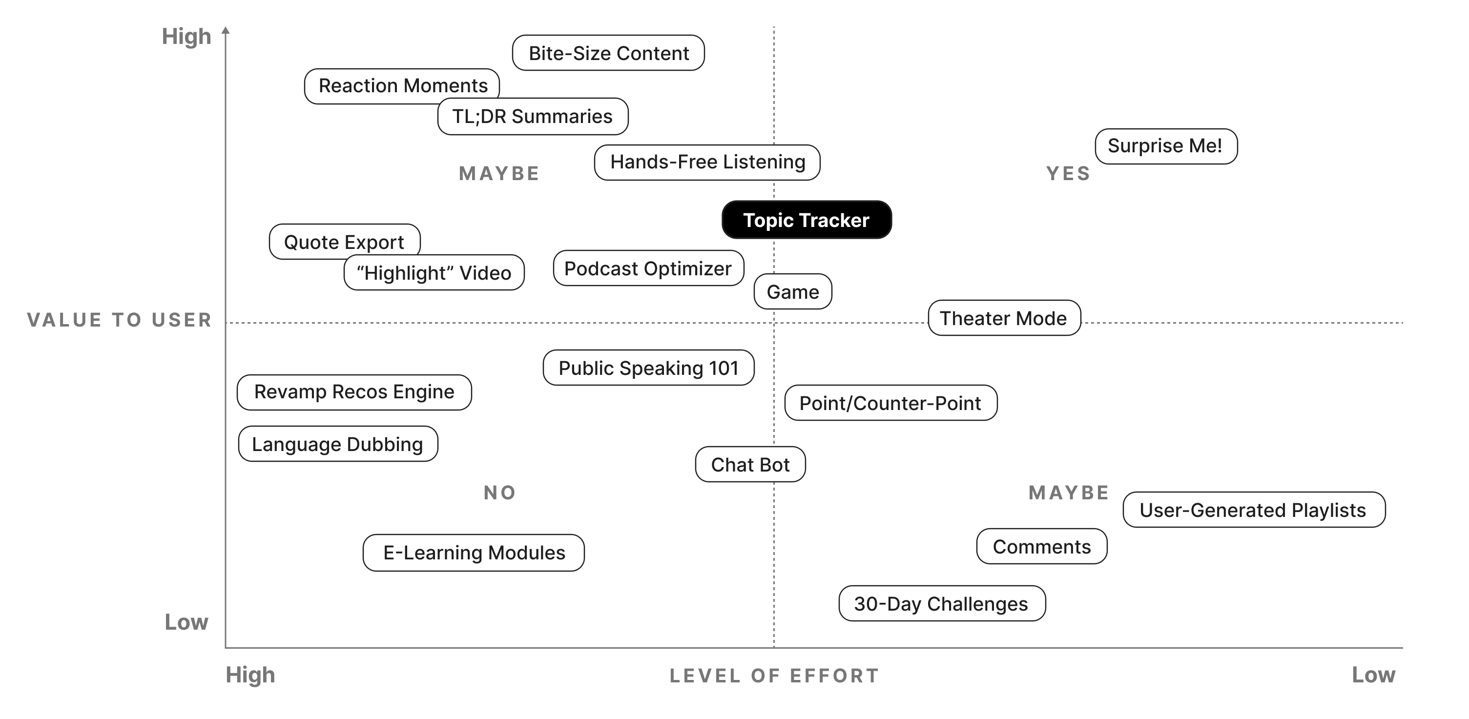
And the winner is...
Topic Tracking—a new idea born from concept testing
See a category breakdown of content you’ve consumed in the app.
Gives users a reason to come back, since visualization changes to reflect consumption.
Users can export their visualization as a shareable graphic.

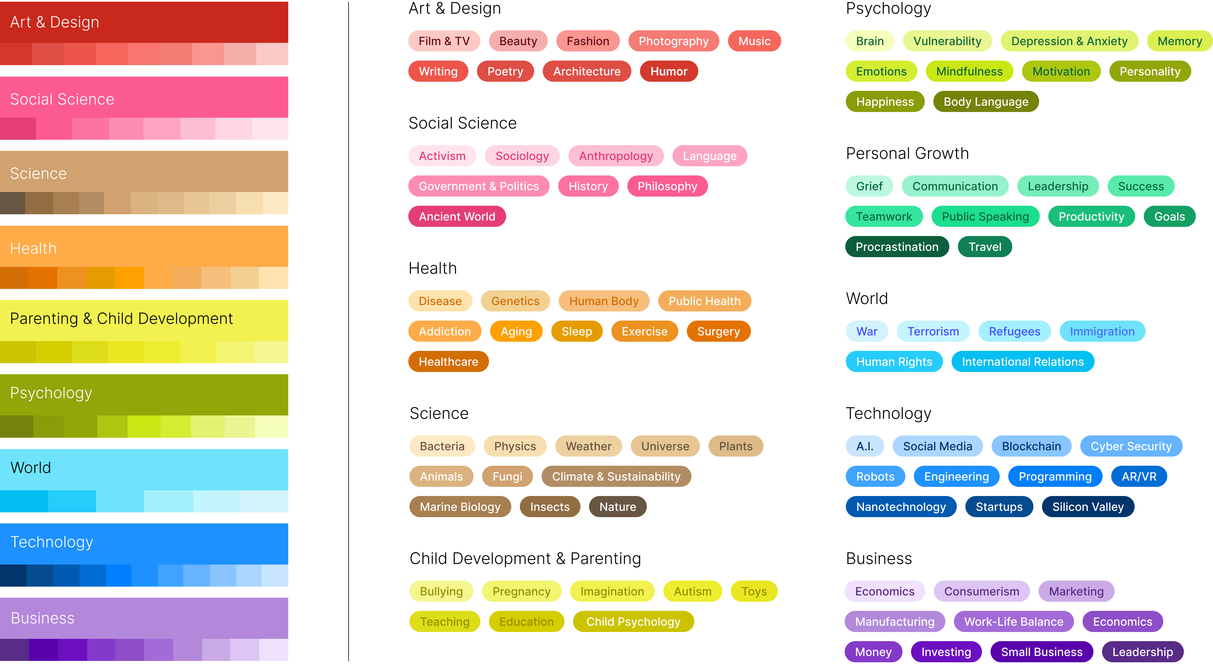
Topics are synonymous with TED.
When asked to describe TED in their own words, people almost always mention the word topics. Topics are crucial to our value prop—we expose users to topics they wouldn’t normally seek out, making them more well-rounded. However, we knew our topic taxonomy was broken, since analytics showed critical navigation bottlenecks occuring on the existing topic landing page.
I collaborated across teams to restructure the IA taxonomies of 100+ topics, scaffolding them into 10 parent categories. In this polyhierarchical system, some subtopics are assigned to multiple parent categories. Negotiating the right level of granularity was a challenge, so we conducted tree testing and card sorting to determine the best labels and distribution for each category.


Devising a visual language
I developed a visual language by assigning colors to topics, ensuring accessibility by adhering to WCAG contrast guidelines.
Design exploration
Experimenting with common & fringe cases
How can I design an experience that supports the most-and least-common use cases in a way that’s easy to understand?
Analytics told us the average user would see a consumption of 16 topics. (3 topics minimum, 102 maximum)
Starting with extreme cases, I was able to rule out non-viable designs early on.
In this process, user stories and scaling issues arose (e.g. What happens when we add more categories?). To answer these questions, we needed another round of testing.
Determining MVP
What functionality should we release as MVP?
As a user, I would like to....