Aaron’s
About Aaron’s
Lease-to-own furniture, appliances and electronics retailer
Objective
Increase conversion by enhancing the online leasing experience
My Role
UX Lead—Uncover UX opportunities and pitfalls, paying close attention to the online leasing experience. Make customers feel more confident signing a contract online for a big-ticket item.
Results
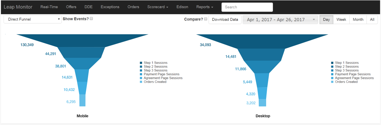
+6% increase in conversion. (More users entering funnel and churn reduction at References step of lease application.)
DISCOVERY
Analytics Analysis
Setting benchmarks and learning how users interact with the site
Reviewed traffic, click-map and page-timing reports, honing in on abandonment and rage clicks within sales funnel
Observed recorded site sessions (via FullStory) to establish root causes of friction
DISCOVERY
Heuristic & Competitive Audits
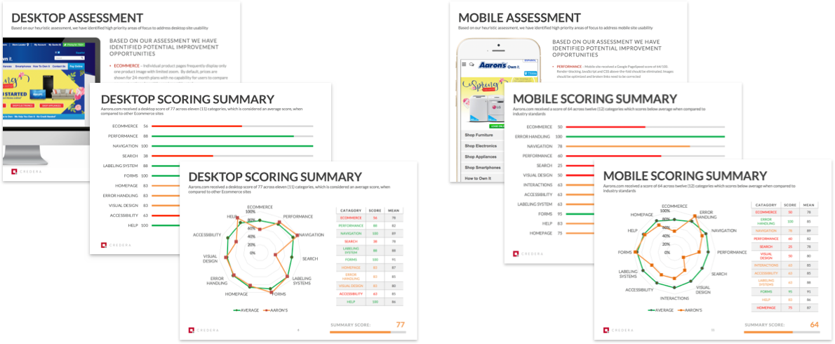
Conducted UX diagnostic of Aaron’s desktop and mobile site to uncover usability issues, which I indexed by severity and frequency
Mapped solutions to each issue in a backlog of incremental design changes, starting with quick wins
Conducted same evaluations of competitor websites
DISCOVERY
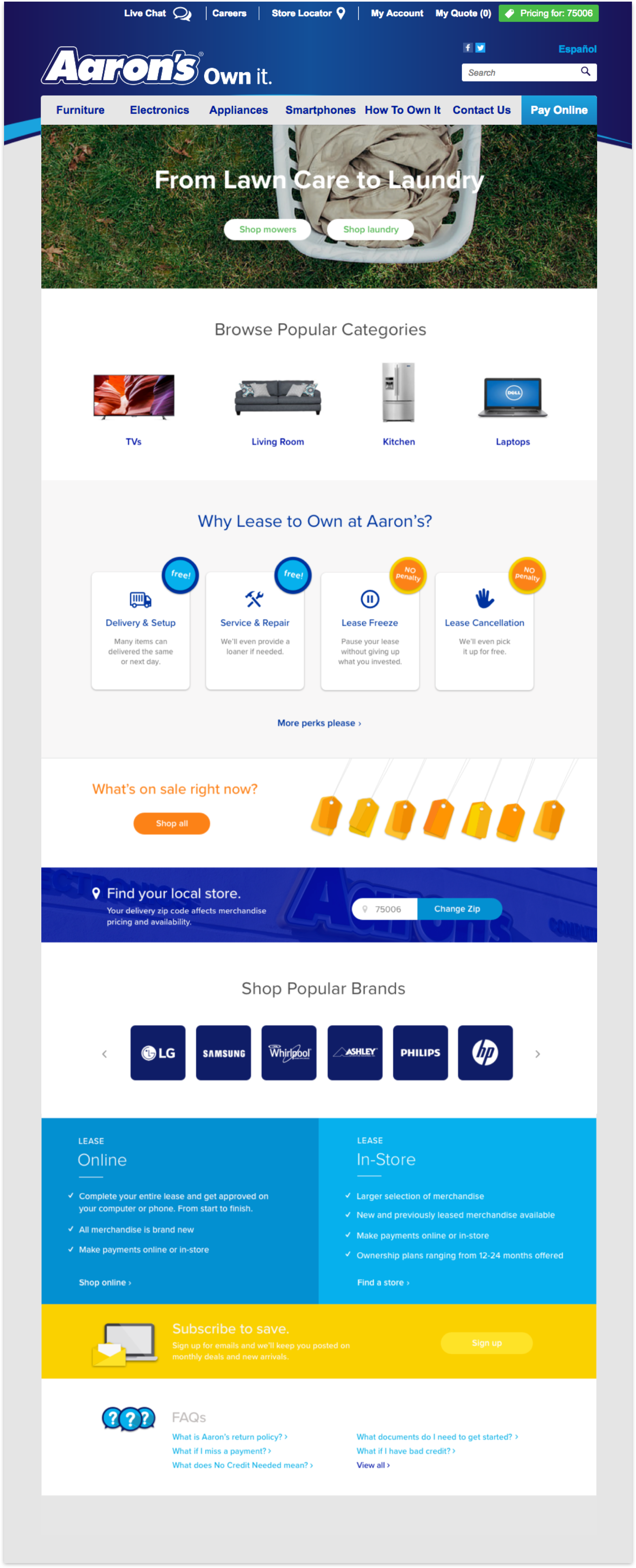
Original Homepage
Poor content taxonomy conceals breadth of offerings and fails to inform users they can lease online
Homepage should communicate what the site is, what you can do on the site and why you should be on the site
No messaging to let users know they can lease online
Narrow path scopes promote shallow parent categories
Redundant CTAs compete for attention and regurgitate links from universal navigation
Most prominent CTAs generate fewest clicks (7%)
Content from high-traffic pages is minimal or absent (e.g., How to Own It Online)

DESIGN
New Homepage
Reimagined content hierarchy addresses misgivings upfront
Leverages findings from competitive research to articulate Aaron’s value proposition and make users feel more confident leasing-to-own online
Introduced comparison table to (Leasing Online vs. In-Store) to inform users everything on the site can be leased online
Made it easier to access most popular content by including language from How to Own It Online page
Added Shop by Brand and other inspirational paths to help users make better scope selections
Refreshed visual design, while adhering to off-limits UI elements


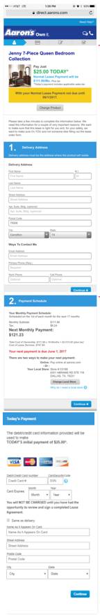
DISCOVERY
Original Lease
At first glance, 3-step flow seems simple, since most fields were deferred to (excruciatingly long) final step
Flow follows ‘clicks-are- bad’ logic. But, cognitive load of form-field wall is worse than interaction cost of several mindless clicks.
Dual-column layout interrupts vertical momentum of moving down the form

DISCOVERY
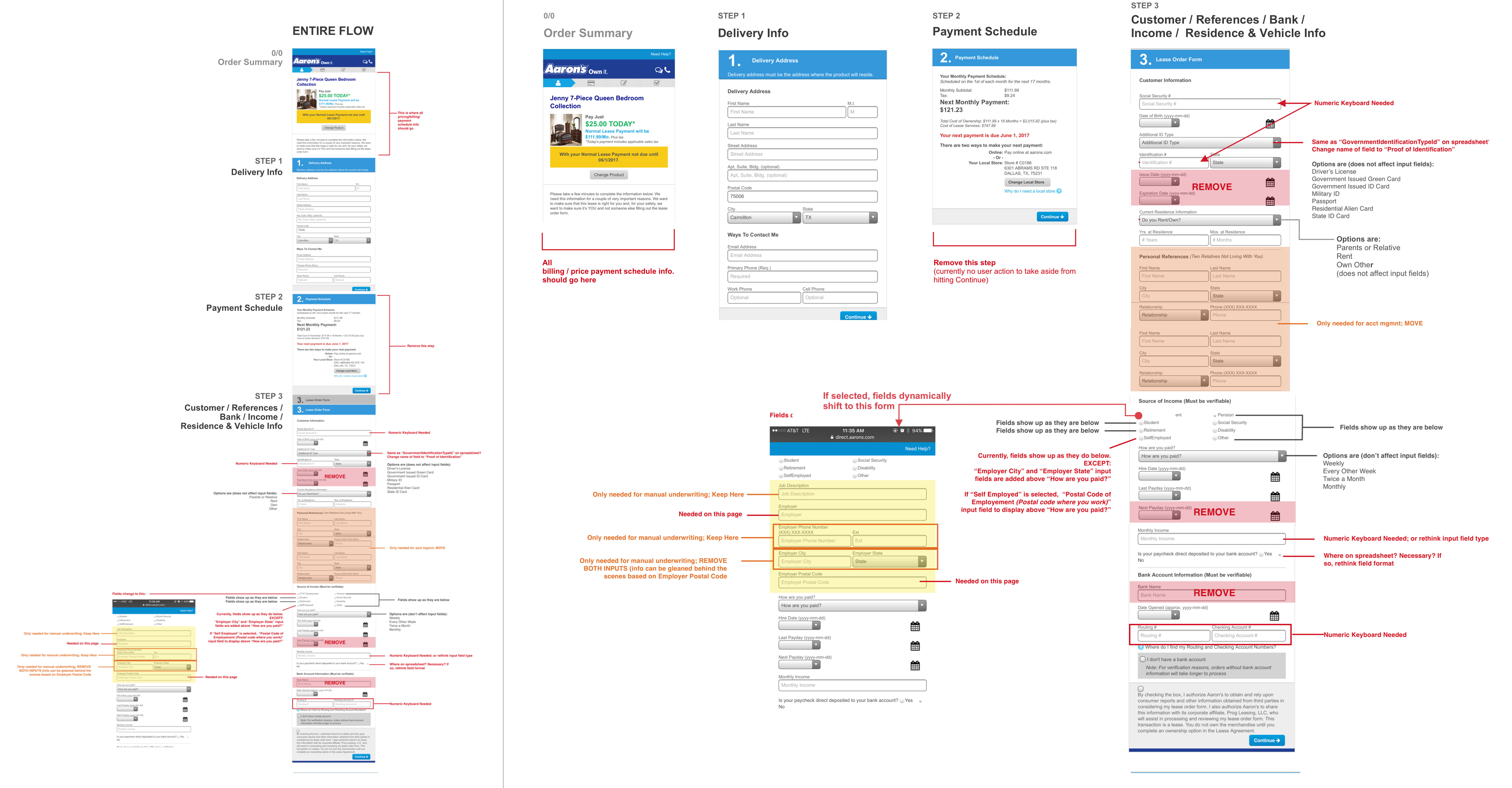
Dissecting the Flow
Interrogated every form field to find opportunities for optimization
DESIGN
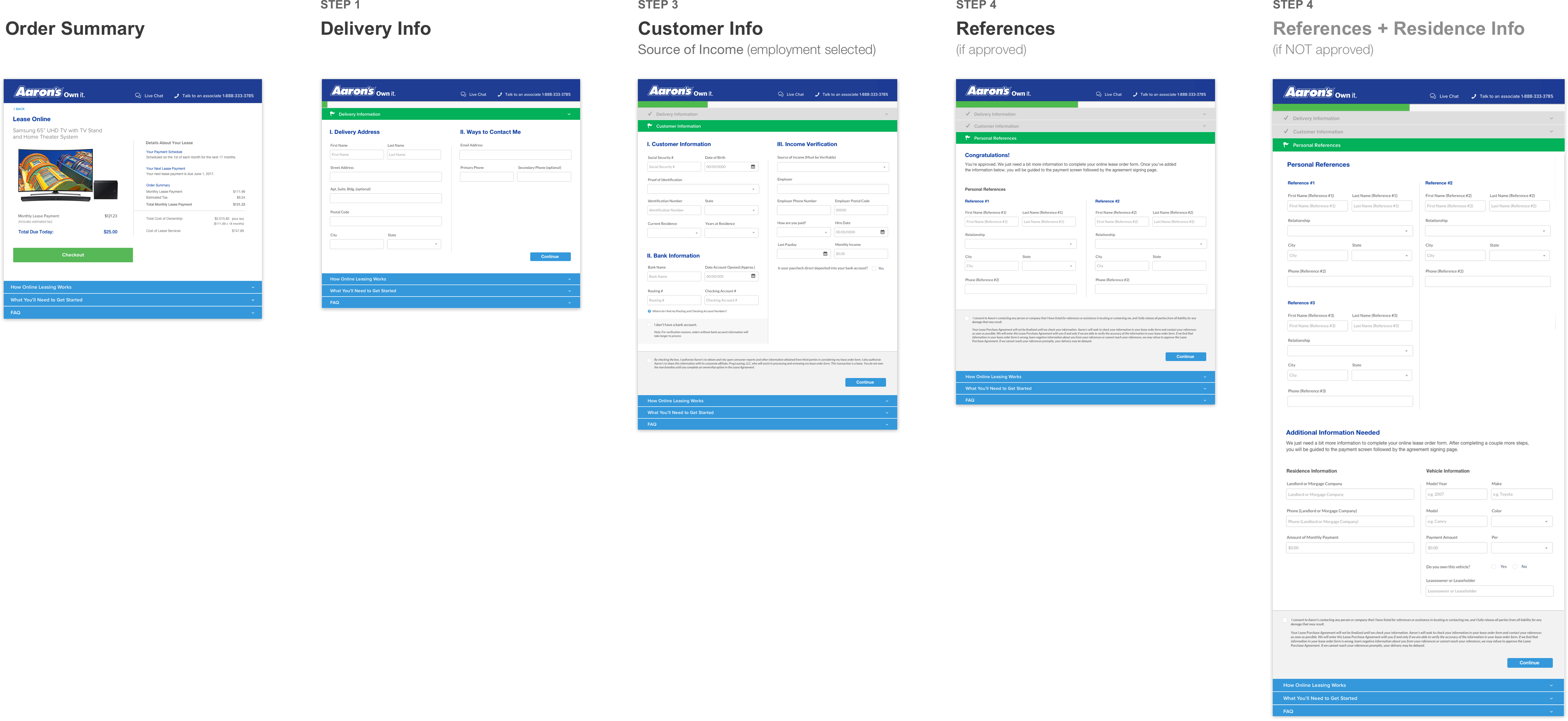
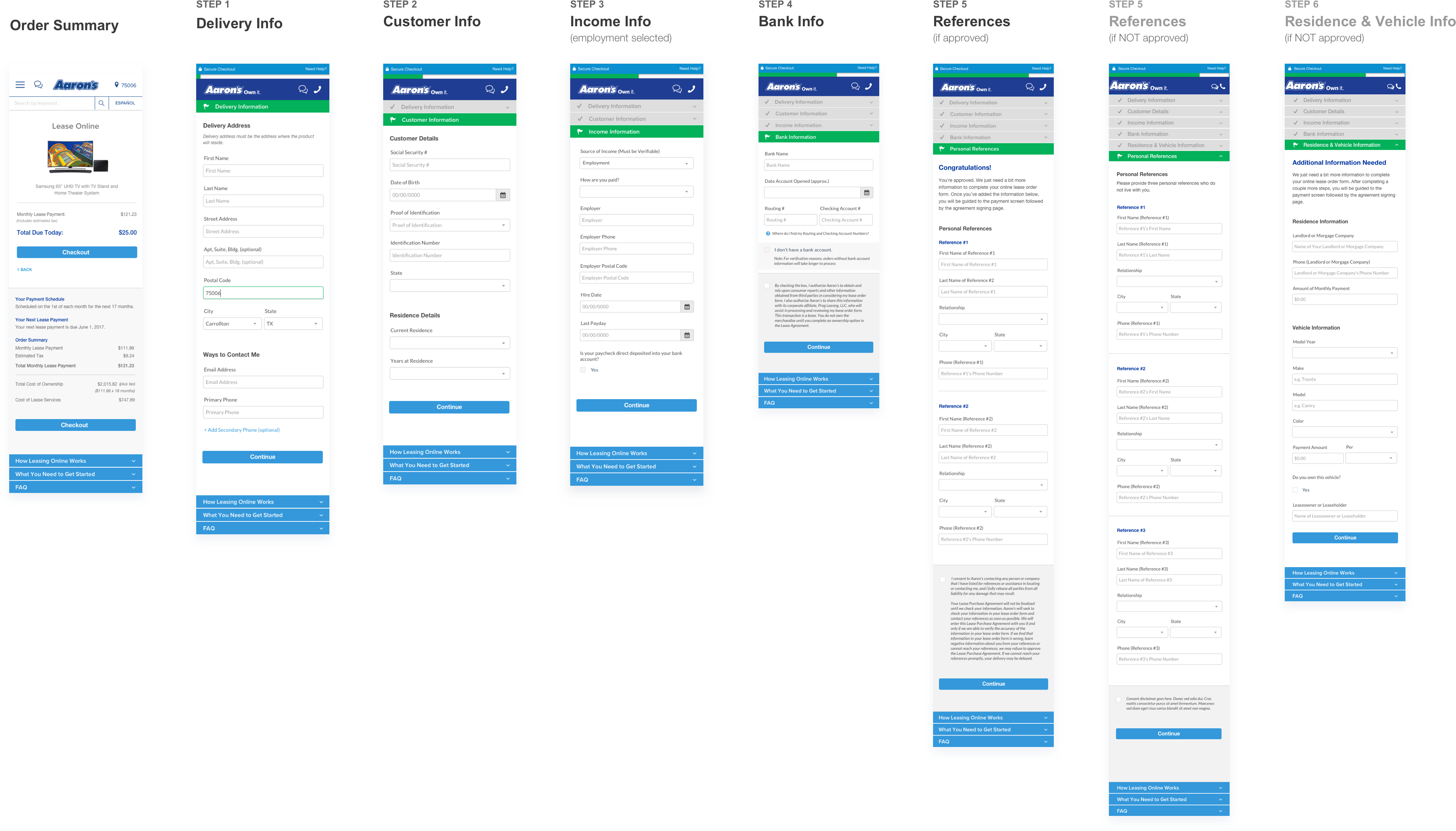
New Lease Flow
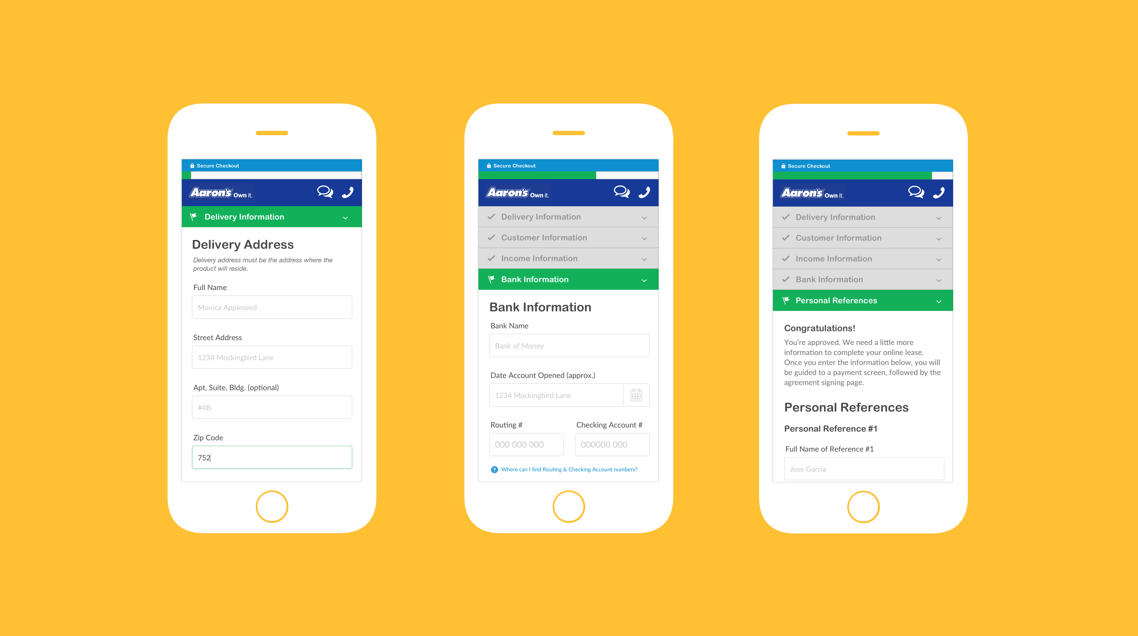
Restructured to reduce complexity and optimize for mobile
Used progressive disclosure to create a linear flow comprised of bite-size steps to help users move quickly & assuredly through the application
DESIGN
Putting first things first
Qualifying applicants upfront
Qualifying applicants for credit approval upfront allows 15 fields to be removed from remainder of lease for instantly approved applicants
Qualifying applicants for credit approval upfront allows 15 fields to be removed from remainder of lease for instantly approved applicants
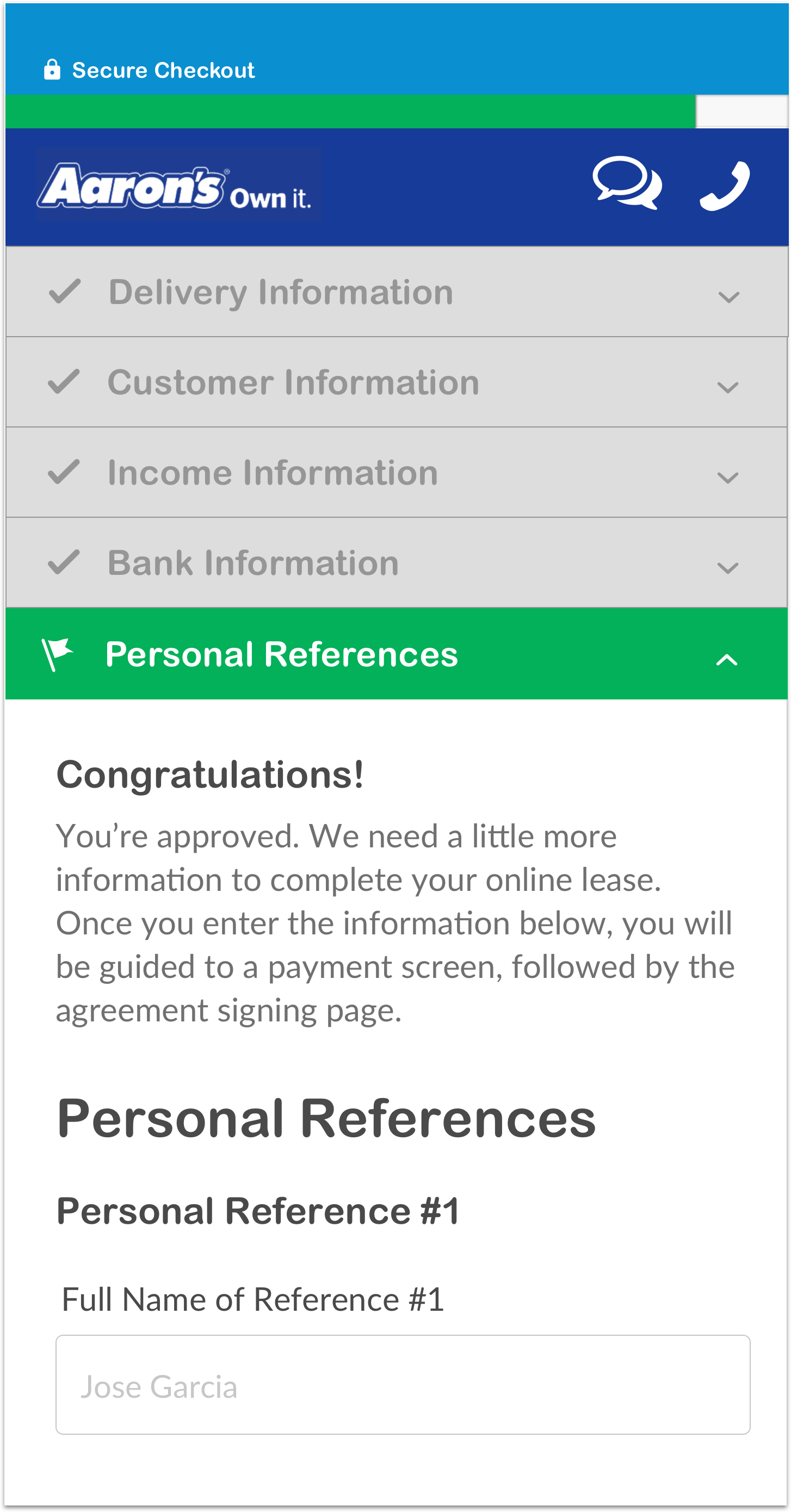
These applicants now receive a congratulatory message, to motivate them to forge ahead through the most grueling steps (which I purposefully deferred)
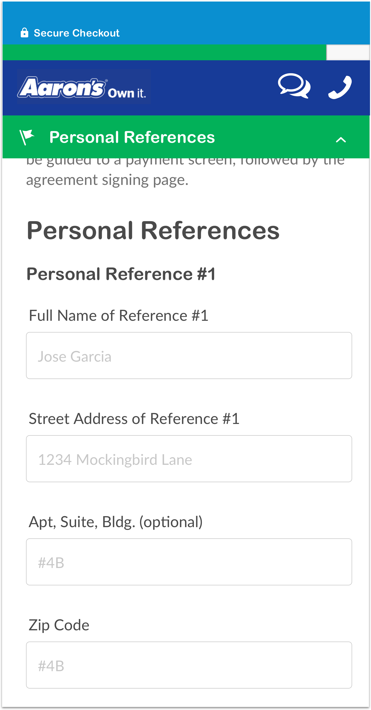
Saving the worst for last
Deferred most grueling part of application (Personal References) to the end, since highly motivated users are often more willing to tolerate higher interaction costs
Managing expectations
Added a new step to set expectations upfront about what checkout process entails and what info users will need
Added a new step to set expectations upfront about what checkout process entails and what info users will need
on-hand.
Trade off: potentially increasing early abandonment for an increase in overall competion rate
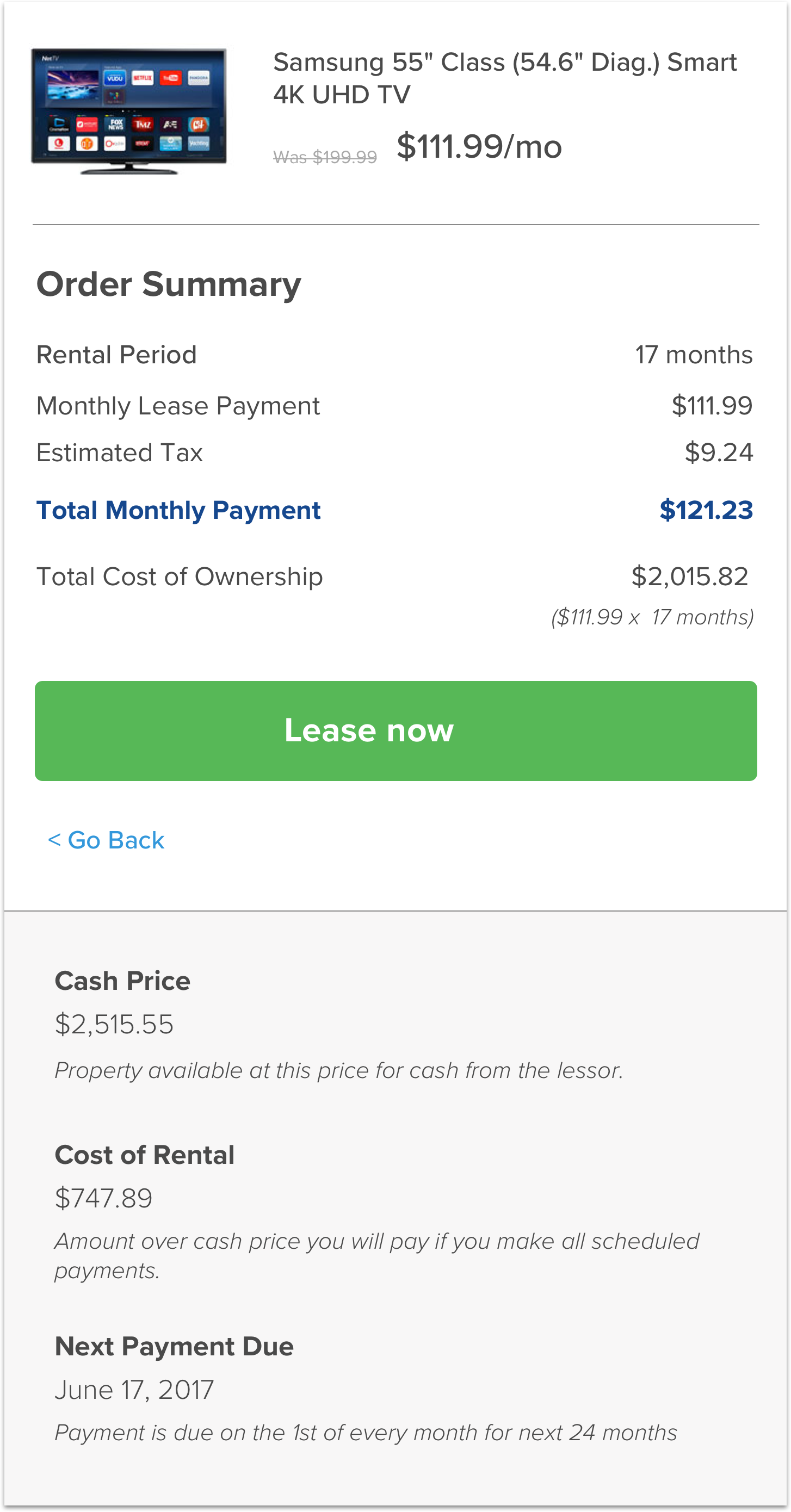
Putting Price/Availability Upfront
Folded monthly payment amount, # of payments, cash price and total cost of ownership into first step, so biggest purchase-decision indicators are presented upfront.
Folded monthly payment amount, # of payments, cash price and total cost of ownership into first step, so biggest purchase-decision indicators are presented upfront.
DESIGN
Making it easy to supply inputs
Since 2/3 of applications are accessed on mobile devices, optimizing the mobile experience was crucial
Numeric keyboard prompted as appropriate
Input methods (e.g., drop-down menu) match field (e.g., income range)
Increased size of touch targets
Implemented single-column layout
Added padding between fields and labels
Added persistent progress bar to reduce uncertainty and give users a sense of their progression
Results